4 Ways to Enable HR Business Partners to Succeed with People Analytics
HR business partners need people analytics. An expert shares four clever tips for HRBPs to optimize insights.

By David Tregidgo, HR Director – Finance Global Markets, Unilever
People analytics and driving evidence-led HR is a real passion of mine. I was previously our people analytics and employee insights director, and then switched to lead a team of HR business partners (HRBPs) supporting over 4,000 finance employees. I have been reflecting on what’s worked well, and where we could drive even greater business impact.
When I was a people analytics leader, I prided myself on ensuring that what we did had the most impact possible and made end users lives easier. These end users: people leaders, HRBPs, and what we called experience leaders in HR. These four things will enable your HRBPs to drive immediate and lasting effects on the business with people data and analytics.
Bring in HRBPs by avoiding unnecessary noise
We had survey results from our 150,000 employees, conducted during lockdown and the rush to remote work. The people analytics team spent a week poring over the data and building a presentation for the board. Crossing certain data sets provided great insights.
In particular, we saw clearly that people who work long days vastly increased their sense of well-being and happiness with their job if they disconnected from that technology for at least 90 mins at roughly the same time everyday. This was a killer insight that aligned with board ambitions to make work/life balance for our people a priority.
The board loved it so much, you could see the phone cameras out and whatsapps heading straight to their HR leads messaging “I want this for our team.” The reaction of HRBPs though, was incomprehension: What is this? I don’t know how to do that. I don’t have access to that data, and even if I did, I don’t have the software to analyse and visualise it.
As a people analytics function, we had uncovered a brilliant insight and proceeded to create confusion and noise.
Solution: Our formal network of organisational analytics leads work as part of HR teams but received special training and additional access to data. Going forward, we delayed giving the board these insights by one day. In this breathing space, we briefed the network, provided ready-to-go drill down analytics where possible, and outlined the limitations of the data—for example some things are universal truths that due to sampling sizes you can’t recreate for smaller teams. Letting people know this upfront and having ready-to-go packs can really save unnecessary noise.
Sample size affects people analytics accuracy
“Team A saw a 6% increase in well-being, while Team B saw a 5% fall in the same.”, “We must learn from Team A! Team B has real issues and needs more attention”.
Have you heard this one before? It creates lots of work and can put lots of pressure on people. But is this the real story?
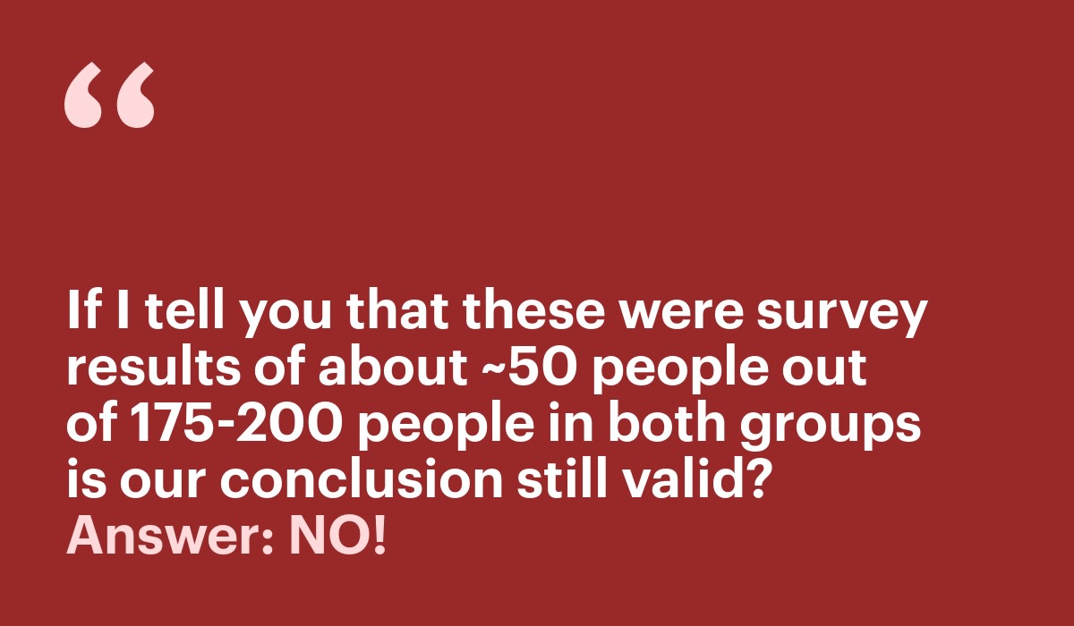
Sample size matters. Are these samples actually large enough to be statistically significant? If I tell you that these were survey results of about ~50 people out of 175-200 people in both groups is our conclusion still valid? Answer: NO! These movements could just be random noise. A common analytical error led to a whirlwind of misconceived activity, some of which might be damaging to the organisation.
If you have a sample size of ten responses, your error rate can be as much as 30%. This falls to 3% when you have 1000 respondents ( rough approximation). Poor analyses and the bad decisions that flow from them are a scourge of people analytics functions’ potential for impact, and can be toxic to the reputation of the discipline.
Solution: Share, promote, and socialise these rules-of-thumb margins of error so that people recognise real significance and ignore false flags. Make them part of the day-to-day parlance, so that staff and partners at all levels become familiar with the concepts. Also build significance into the analysis. For example, use the settings of data visualisation software to show where a number has high or low confidence attached to it because of the size and solidity of the data behind it.

Make sense of organisational hierarchies
Right now, amid The Great Resignation, there is a demand for attrition reporting to get a better understanding of who is leaving companies and why. As people analytics leads, you may have been asked for dashboards on attrition recently.
Running such analysis across organisational hierarchies has inherent pitfalls, because the hierarchies often don’t match operational realities. I certainly know that I have a choice of multiple hierarchies and none of them perfectly represent what my business leader is exactly responsible for. And on top of this I have yet to come across any business that has organisational hierarchies fully up to date!
Solution: Build awareness in the HRBP community of the different ways of looking at the organisation, and different ways leaders might want to look at the organisation. This is not always a strength we have, particularly when thinking about using finance hierarchies.
Standard reports are very useful—comparing attrition rates in finance with sales, perhaps— but it’s important not to stop there. If an exec is going to do something with this information, they are going to need filter options. Also, the way we can view the data switching between geography, org unit or sub function whilst also filtering can make a huge difference to ensuring the information is actually used and useful. It can feel like replication, but it’s very useful for HRBPs.
In my HRBP team, I asked one of the team to explore the data look at what was driving our attrition. Was it a whole country issue or specific to finance? Despite a busy day job, using Visier analytics for the first time, in a couple days they still managed to uncover not just the hotspots, but the ones where we could make the most difference and those where we needed others’ support.
Improving accessibility
One of our team is partially sighted. I sent out one of our core scorecards to him along with the rest of the team, a beautiful quarterly dashboard shared with execs. It looks fabulous. But then he got me to listen to it through his screen reader. It sounds terrible. It’s impossible to understand what’s going on, and is honestly like having random numbers and text shouted at you or worse blank spaces that have an alternative text that says “Chart”.
Solution: Using the accessibility checker in Microsoft Office to ensure things are optimised for screen readers and describing key messages in charts when using alternative text made things better. Better layouts and guidance on how to navigate also help. Ultimately, ask yourself if the way you are presenting information and the tools you leverage are excluding anyone?
These are just a few of the things I have learnt, and I am sure there are lots of other tips in the community. Hopefully these can help you on your journey.
Creating world-class people leaders depends on access to people data. Find out how to overcome your People Impact Gap by downloading The Future of People Management, a report by Visier and Deloitte.
Interested in learning more about Visier? Get in touch with us for a demo!
