How Visier’s Drivers Visualization Makes Asking the Right Questions Easy
Deep dive into how Visier 's Drivers Visualization identifies the root causes behind how important metrics, like resignation drivers, change.

This article was jointly written by Visier team members Aileen Wang, a User Experience Designer, and Danny Blackstock, a Front End Developer.
Every business intelligence tool is built around a simple promise: To drive value by tracking metrics such as sales, customer satisfaction, rates of retention, and rates of resignation. But as important as these metrics are, it’s not always clear to companies how they should translate into concrete action.
This can be an especially challenging task in HR, where numbers represent people in all their complexity and nuance–not objective values such as volume of goods sold or returned. For HR leaders interpreting people data, there may not be one obvious path to addressing trends that negatively impact business goals, such as a high rate of turnover or difficulty retaining high-potential employees.
Unique to Visier, the Drivers visualization helps close this gap between data and action. The chart shows you the largest contributors behind the changing metrics you care about most and answers questions you may not even have known to ask. Access to this information helps HR leaders ensure they’re focusing their time, energy, and resources as effectively as possible.
AI drives answers to the surface
Visualizing the driving forces behind trends within your organization helps you attain a holistic, granular, and highly specific understanding of your people. Artificial intelligence makes this possible because algorithms process large volumes of data much more quickly than even the most capable humans.
With machine learning and artificial intelligence, it’s possible for even non-technical users to tease out the valuable, actionable insights hidden within their data. For the Drivers visualization, that means identifying the common employee attributes that “drive” a particular metric up or down.
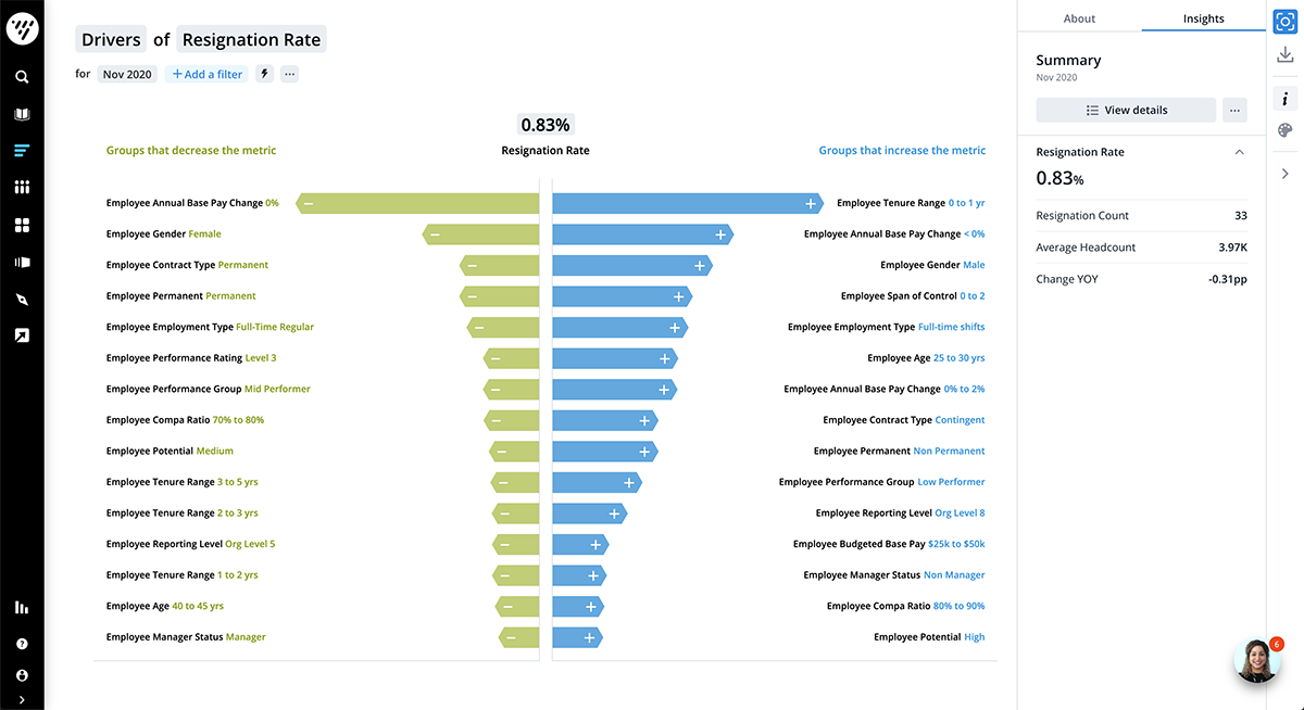
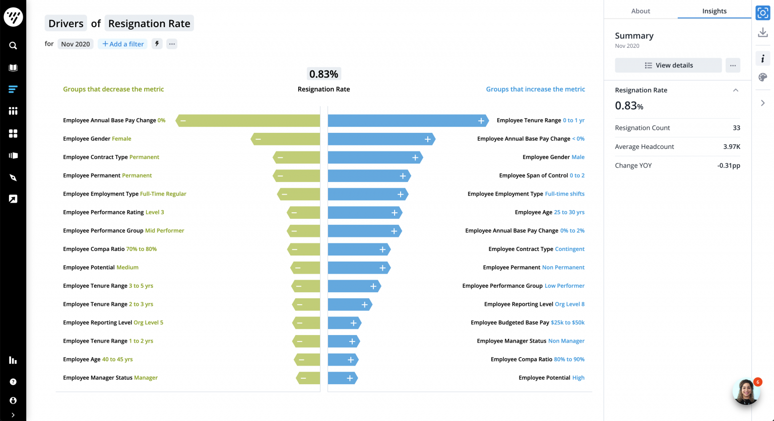
The Drivers chart is structured as one central axis, with contributing factors represented as arrows extending away from it in both directions. Negatively correlated factors point to the left, while those positively correlated point to the right. For ease of reading, only the segments having the most effect on the metric are included, and they are ranked in descending order according to their level of influence.
Rather than simply presenting the user with a metric, the chart shows which groups or employee attributes within the analyzed population are responsible for driving it up or down.
For example, instead of just showing a skyrocketing rate of resignation, the Drivers chart breaks down the attributes behind that change, answering questions like:
Do the employees who are resigning work under a specific manager?
Is the rate of resignation being driven by employees in a certain geographical area?
Do employees tend to exit the company after working for a certain length of time?
Is the rate of resignation higher within any ethic or other demographic groups?
This makes it easy for even the casual user, who might not have prior experience with analytics, to locate the driving forces behind pressing concerns in their organization.
Visualizing change through a much-needed redesign
In Spring 2021, our teams gave the Drivers visualization refresh. The Drivers chart has always been one of Visier’s most powerful — and popular — ways to visualize data. It was created to make in-depth understanding of organizational change easy, immediate, and accessible. Therefore, it was crucial for the design to eliminate unnecessary information and stay as simple and intuitive as possible.
The goal was really to just make the information as clear as possible, in the most easy to understand form.

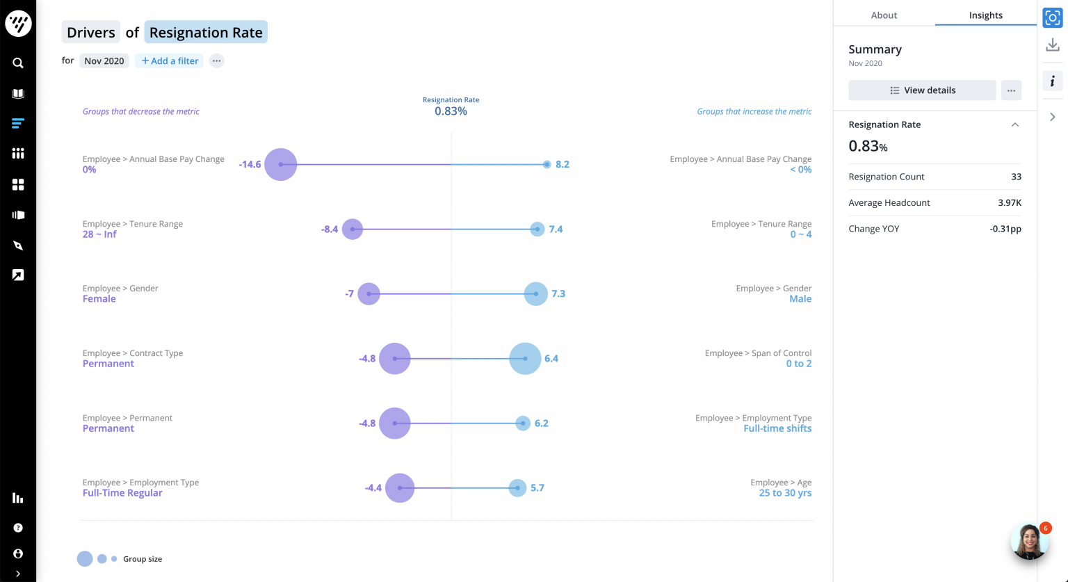
What the Drivers Chart looked like before the refresh design
Users needed the information in the previous Drivers chart, but there were several issues with its design they found distracting and confusing. Because the left- and right-pointing bars were connected, many users mistakenly thought they were correlated in some way. Both the circles representing group size and the labeled driver scores also proved confusing, as did the choices of color, perhaps because they were not sufficiently differentiated.

The Drivers Chart as it looks today
We specifically worked on making it easier to read and simpler so now, it’s targeted towards a more general-audience user and there’s less to interpret, whereas before it was meant for more advanced users.
Now, the two columns are separated to demonstrate that they represent two separate lists of attributes. They also removed the bubbles, and set the drivers score labels to appear only when the user hovers over the relevant bar. Users can now set their own colours for the chart, making it clear that the pre-selected colours have no specific meaning.
Because HR is a generally non-technical field, it was especially important that the chart be usable for customers at every level of comfort with data and technology. Now, the chart fulfills its original function, but is more closely tailored to its users’ practical needs.
In practice: Using data to reduce employee turnover
At one consumer goods company, understanding the driving forces behind changes in their 8,500 person team helped leadership more effectively connect HR initiatives to overarching business goals.
While this organization has a global reach, manufacturing and selling its own products in over 80 countries, the relatively lean size of their workforce means that every person mattered, and employee-related issues could negatively impact profits and productivity to a concerning degree.
Employee turnover was a major concern at the company’s manufacturing department, which was the first group to start using Visier. Because Visier made it quick and easy to identify the driving forces behind their high rate of turnover, the company was able to identify that new hires were the group most likely to exit the company.
That knowledge empowered HR leaders to take corrective action — in this case, investing time into improving their hiring process to emphasize retention, including setting clearer expectations with new employees prior to hire.
Insights need to be more accessible
For many HR leaders, working with analytics is already an unfamiliar task, let alone determining how best to practically apply them towards business goals. A well-designed analytics solution should take that burden off the user, making it obvious where action and effort should be directed in order to correct or exaggerate existing aggregate metrics.
While the Drivers visualization is one of Visier’s most unique assets, it’s just one more tool to help users achieve a greater goal — translating the power of data into tangible, real-world business outcomes.


