HR Data Storytelling and How to Use It for Your Business
Learn how data storytelling transforms complex information into actionable insights for your business and why this matters when using it for the first time.

Have you ever tried to navigate a large city without a map or anyone to help you find your way?
You may be successful and reach your destination. But it will be a challenging experience and you’ll likely get lost several times.
Trying to understand databases of raw information is similar. The map that will save you in this case comes in the form of data storytelling. This practice takes raw, complex data and turns it into easy-to-understand information.
This article will help you learn everything you need about data storytelling to use it successfully within your business.

What is data storytelling?
Data storytelling is the practice of using data and visualization techniques to convey information in a compelling and easily understandable manner.
Having database upon database of complex data is a reality that most companies face. Employee information, performance metrics, marketing resources—everything you do relies on data. But to gain valuable insights, you must relay that information in an engaging way that all beginners can understand.
Otherwise, only a few highly specialized people will make sense of the numbers. For the vast majority, that data will be useless. This is where data storytelling comes in, helping you make sure valuable insights from your data aren't lost. Instead, they’ll be shared in a simple, yet powerful manner.
The importance of using data storytelling in HR
The HR sector relies heavily on data. You collect personal information during the recruitment process, then add employee metrics and other complex data that are essential for the company.
Here’s how data storytelling helps you ensure you’re using it effectively:
Enhances communication of data insights. People data like employee engagement, turnover, or recruitment metrics may fall primarily under HR’s responsibility, but the insights driven from it affect the entire company. Data storytelling allows HR to present information in a clear, engaging, and easy-to-understand way that resonates with stakeholders and leadership.
Simplifies data comprehension. HR data can be complex and multifaceted. Even something seemingly simple (e.g. employee turnover) must be analyzed carefully. That includes looking at it from different angles to see the full picture and understand the underlying causes behind the problem as well as potential solutions. Data storytelling simplifies and distills this information into digestible narratives. In turn, this enhances the audience's understanding of the data's significance and implications.
Provides insights that lead to strategic decisions that improve business outcomes. By weaving a narrative around HR data, storytelling helps contextualize the information and illustrate its impact on the organization. This enables data-driven decision-making aligned with strategic goals for talent acquisition, development, and retention.
The role of people analytics and visualization in data storytelling
People analytics is the practice of collecting people data from multiple sources, bringing it together, and transforming it into meaningful insights. It helps you transform raw data, which is often hard to read or understand for anyone who isn’t highly specialized in a certain field, making it easy to understand for anyone in the company.
People analytics has another remarkable benefit. It offers various types of data visualization that are an incredible ally when you want to tell the true story behind your data. A people analytics dashboard, for instance, can include data points such as headcount, employee performance, turnover rate, and more.

You can use a single dashboard to visualize all the various HR metrics, or you can use separate ones depending on the data itself. For example, some companies may choose to separate recruitment metrics from performance-related metrics, to tell different stories and analyze data from different angles.

Visualization and narrative in data storytelling have an almost symbiotic relationship, where each complements or enhances the other.
Data visualization provides a clear and concise representation of the data at hand. You can view everything at a glance with minimal effort, understanding relationships and other important patterns.
The narrative in data storytelling provides context, guiding the audience so they can understand why certain patterns are critical so they can gain meaningful insights.
What are some examples of HR data storytelling?
HR data storytelling helps give sense to the numbers and the raw metrics that would otherwise make little sense to most people in a company. Let’s take a look at a few examples:
1. Employee retention and turnover
Understanding what motivates employees to stay, and what the drivers of resignation are, is imperative. When employees leave unexpectedly, it can cause performance and productivity problems. You suddenly have empty positions and nobody to do that job. By the time you find a replacement, you might already see severe revenue losses.
To reduce the chances of such a scenario, you need to understand why employees are resigning. Can you see a moment when a mass exodus took place? If yes, do you know what happened leading up to that moment? Even if it’s not a mass exodus, data can still show you the “why” behind a resignation.
Through visualization and data storytelling, you can find this “why” and gain deeper insights that could help you forecast future turnover trends.
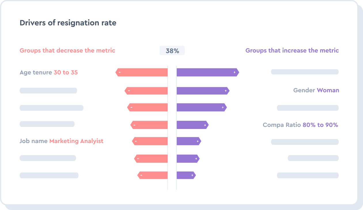
The graph above provides an example of the drivers behind the resignation rate. Data visualization and storytelling come together to help analyze the groups that are most likely to quit versus those more likely to stay. Data analyzed includes gender, age group, compa ratio, and job title.
2. Total rewards and compensation
Compensating employees fairly ensures both higher retention as well as performance and productivity. But handing out rewards randomly isn’t the best of strategies and might leave you with budget issues in the long run. So how can you use the total rewards more effectively?
Total rewards extend beyond compensation. They include all merit increases and other bonuses an employee might get. There are various tactics you can use to improve the effectiveness of your total rewards. To ensure your compensation strategy is effective, look into:
Aligning your reward system with organizational goals and values
Personalizing rewards
Communicating the conditions to get an increase or a bonus
Evaluating impact
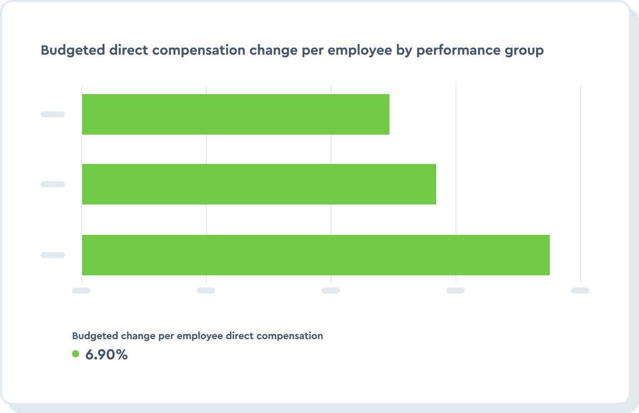
Data storytelling and visualization can also assist you in this complex process. For example, merit increases are a common type of reward but a sensitive one to implement. Now answer: What constitutes the type of performance that will earn such a bonus and how can you assess it? What would a performance/merit increase correlation look like?
Through visualization and storytelling, you can look at individual employee performance. You can also see this important metric from a different angle, exploring performance per department, per project, or for a given period. The graph below shows an example of a performance-based employee pay raise.
3. Productivity and performance
Assessing productivity and performance objectively is sometimes one of the hardest tasks for people managers. Often, information about performance and the people doing the work is analyzed separately from the information about the work itself. That means the majority of the decisions in this space are left to individual perception and can be subjective.
The best way to reduce subjectivity is to use evidence when assessing performance and productivity. This will support managers in making data-informed decisions when evaluating employees’ work.
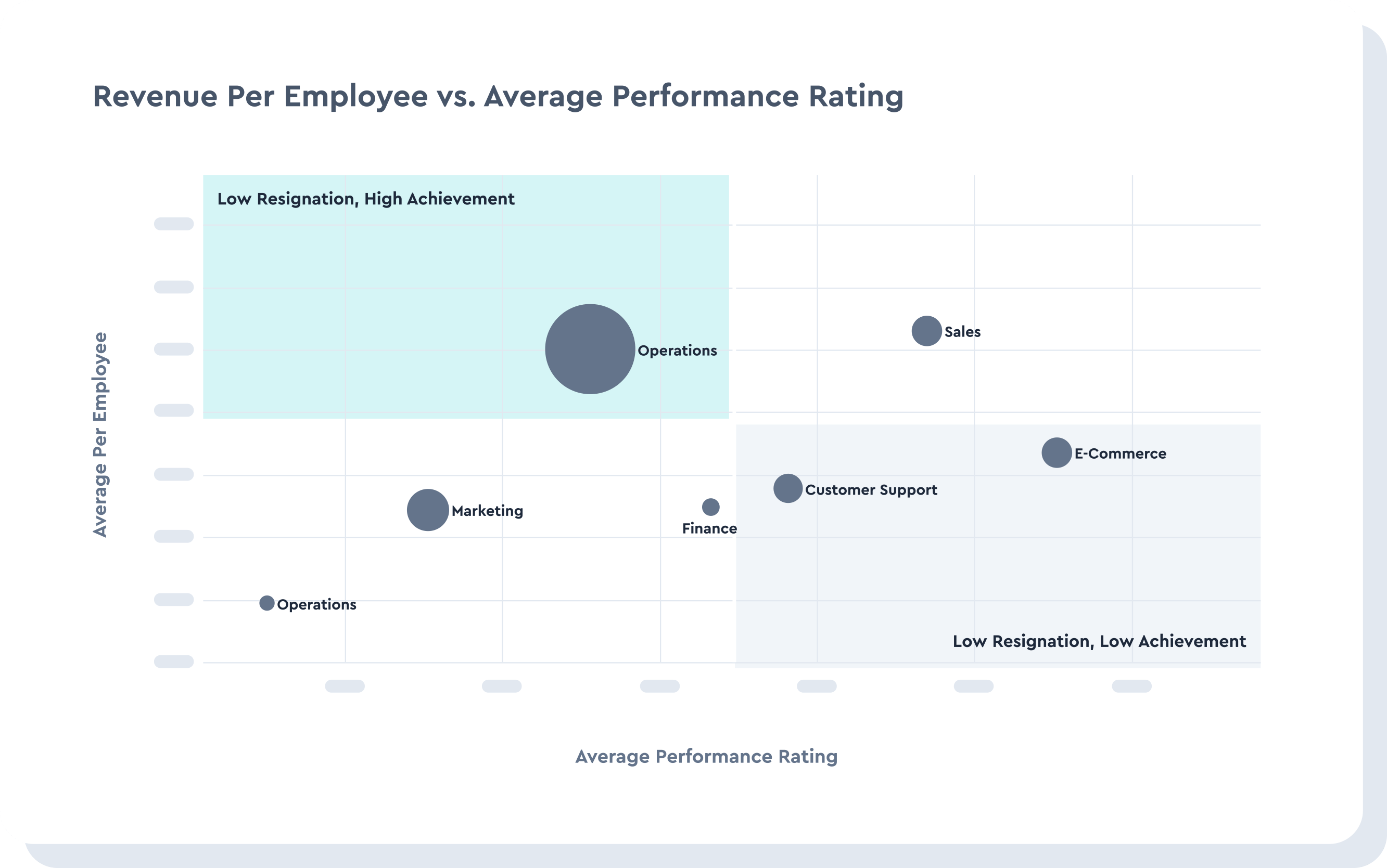
Data storytelling remains the foundation of objective, data-informed decisions. The graph below provides an example of how storytelling can help better visualize the relationship between revenue per employee and the average performance rating. This helps track how performance delivers key outputs so you can make better decisions to increase productivity and reward employees.
Whether you’re trying to use data storytelling to improve retention, understand turnover, boost productivity, or something else, the idea is the same. This practice will improve your decision-making process, taking guessing and subjectivity out of the equation, and ensuring you’re creating the best strategies for your business.

Learn more about data storytelling and data visualizations
Explore how data visualization empowers your HR team. Dive into our guide to tackle data visualization effectively for HR analytics, shaping informed decisions for every use case.
To add strategic value, HR analysts must embrace the art of analytics storytelling. Here are the four elements to create an analytics story. These are the four elements of analytics storytelling.
Visual analytics is the use of tools and techniques to visually represent data to facilitate better decision-making. Learn more here.
