Visual Storytelling: Are HR Data Visualizations or Infographics the Key to Success?
Infographics are everywhere, but can they tell a full story? Learn how HR data visualizations can help your teams communicate.

You see them everywhere. Infographics are a hot visual trend in the world of information sharing.
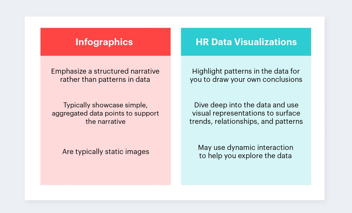
While they can make complex topics easy to digest and share via social media, infographics can prevent people from really understanding important facts and gaining true insight. Sometimes, when people think they may need an infographic, they actually need an HR data visualization.
So, how do you know when you need an infographic and when you need HR data visualization? I’ll get to that in a minute, but first, it’s important to understand the differences between the two.

The differences between HR data visualizations and infographics
The case for infographics
Because infographics are structured narratives, they are powerful in the marketing world: They use data to reinforce a particular message. Infographics can also be used beyond communicating with external audiences. For example, if you work in HR and want to get internal business leaders and line managers to champion a new employee retention initiative, an infographic could be a good approach. You could use an infographic to showcase significant retention metrics and explain how they relate to your initiative. This gives your audience a holistic snapshot of the retention metrics and reinforces how your initiative will engage and retain your company’s star performers.
Check out this example of an Infographic, which provides a “101” lesson on workforce planning
If you’re dealing with simple multi-metric data and need to persuade a general audience to take a particular course of action, an eye-catching infographic may be your best bet. Consider this Globoforce infographic, which looks at the cost of employee turnover.

As you can see here, the infographic does a nice job tying together the various metrics that are used to arrive at the final turnover cost, and makes a strong case for avoiding employee turnover. If the reader was simply shown the $41.33 MM number, they would question its validity. However, by seeing how the number is calculated, the number becomes more believable and empowers the viewer to make decisions in terms of what to do.
For example, they could focus on reducing turnover among senior managers instead of mid-managers, seeing as the senior managers contribute more to a higher turnover cost per person.
However, even though the infographic is effective at sharing the cost message, it doesn’t help the reader get further insight, such as: Is the turnover coming from a certain geography? How is it changing over time? Is there a different pattern between the different employee groups (i.e. is one increasing at a higher rate than the other)?
This brings us to the case for data visualizations.
The case for HR data visualizations
While infographics can be convincing, there are situations when only a data visualization will do. Let’s say your organization is really concerned about succession planning. As our resident evidence-based HR expert, Ian Cook, outlined, “what you need to do is seek out the people within your organization who have the potential to move into critical roles, but haven’t yet been identified. For every person who has already been identified as a top performer, ask: How many more people are like them but haven’t gotten noticed?”
This task is about data exploration, not just data presentation, hence an infographic won’t be effective. You need to trace the career paths for critical roles, uncover the lineage of leaders, and see how departments have developed over time. The below data visualization allows you to do this, because you are able to easily visualize and explore the paths of employees over time – and quickly identify employees on a similar path to those currently in critical roles.
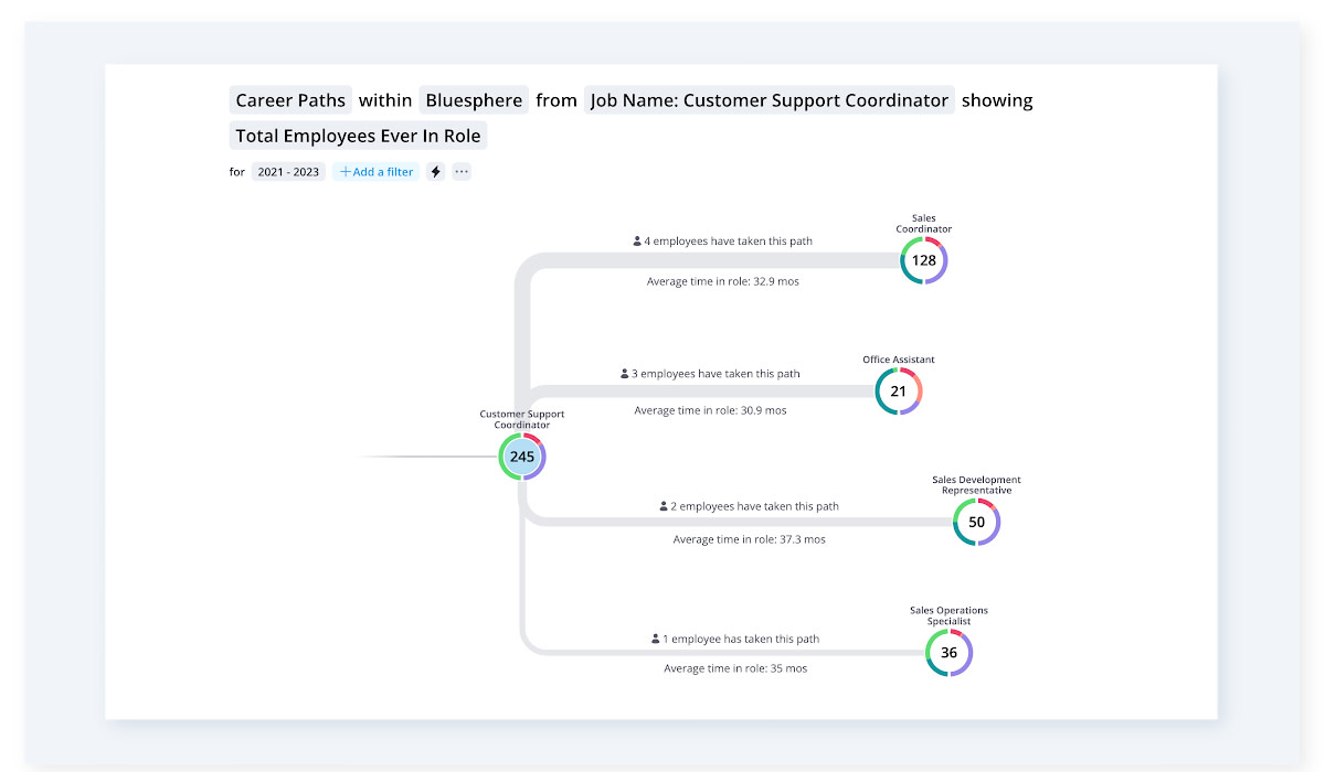
A data visualization presenting potential career paths for a specific employee
Key points for hood HR data visualizations
Here are some key points to ensure your data visualization accomplishes its goal of communicating insight and information:
Wrong data = bad insight. Focus your data on the correct population that you want to analyze. While the individual data points do not always need to be 100 percent accurate, you have to be careful about which sets you choose to to analyze.
Reduce noise to focus on the main question. In the above case, filtering the visualization to just critical employees will help you focus on the useful paths rather than flooding the visual with noise showing the path of every employee in the company and obscuring the insight.
Determine what your question is before thinking about the visual. This will enable you to pick the right metric as well as the right visual. Often encoding the question in the metric is the best way to create a clean and effective visual. For example, if the question you’re exploring is how turnover changed between this year and last year, plotting the difference as the metric would be much more effective than showing it as a trend over a period of time.
Choose the right visual pattern. Imagine what the above talent flow visualization would look like using a bar chart: it would show the characteristics of top performers at a given time point but fail to show how those characteristics changed over time, and hence mask the paths. Having said that, sometimes the most effective visualization is a simple bar chart; don’t opt for more complex visualizations unless they help reveal useful patterns.

I hope these points will help you understand that infographics are not always the best choice when helping your readers gain insight from data. When approached correctly, a well-crafted data visualization enables people to get to the unspun version of the truth more quickly — a critical component of high-stakes decision-making.
More about HR data visualizations and analytics
Data visualization helps you present HR data in a format that HR leaders, people managers, and other users can understand, explore, and use to make decisions.
Self-service analytics empower end users to independently get the insights they need. Learn more about the fundamentals, key components, and how to integrate a self-service analytics platform into your HR technology stack.
Generative AI assistants for HR deliver fast, intuitive, accessible workforce insights and visualizations to people leaders.

